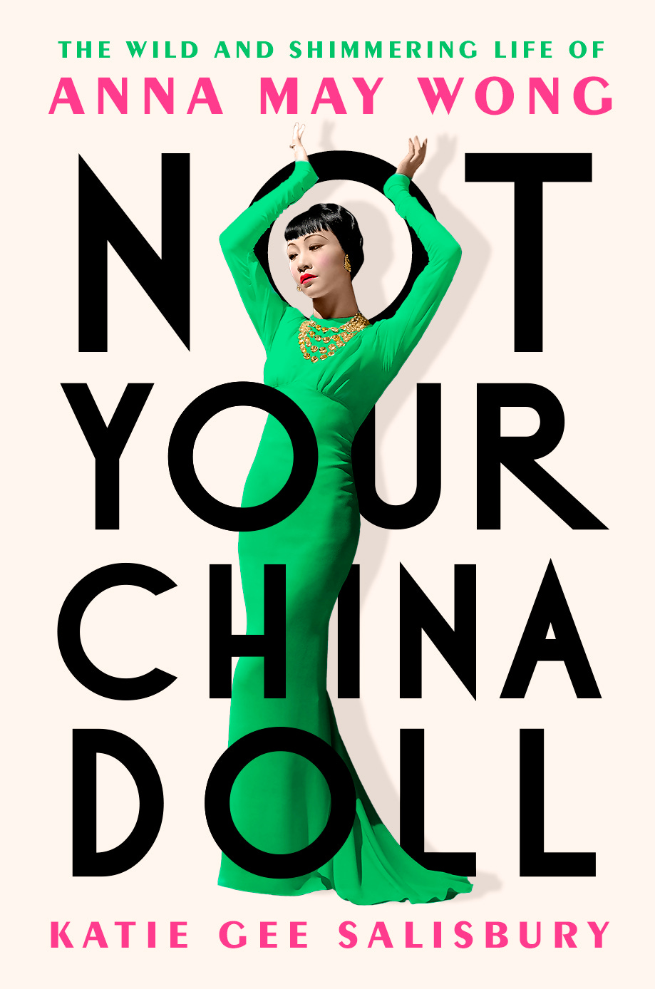
You might want to sit down for this. I have something really big to share with you today—the cover for my book, NOT YOUR CHINA DOLL: THE WILD AND SHIMMERING LIFE OF ANNA MAY WONG.
Isn’t she a beauty? I’m grateful to all of you who have followed me along on this journey. If you’ve enjoyed the newsletter, I have a feeling you will enjoy the book even more. NOT YOUR CHINA DOLL will be released on March 12, 2024 (just in time for the Year of the Dragon, which also happens to be AMW’s Chinese zodiac animal), but many have already secured their copy by pre-ordering the book.
The single best way you can continue to support me is by pre-ordering a copy of the book online or by dropping in on your local indie bookstore and letting them know you want them to carry NOT YOUR CHINA DOLL. Pre-orders matter because they let my publisher know that people are excited about the book. They also help ensure the book is stocked at more bookstores around the country. And well, they give the book a running chance at making it onto bestsellers lists come publication time (though I try not to think too much about that).
Now, I have something to confess. I was pretty nervous about what the cover for my book would look like. It’s one of the few things as an author that you have little control over, and yet, the cover is the window through which most readers first experience your book. “Don’t judge a book by its cover” is a lovely sentiment in theory, but unfortunately, we don’t live in a theoretical world. The cover creates an indelible image that is forever tied to the words you’ve written. And like most writers, when it comes to my work I can be a little bit of a control freak. So, I did what any anxious busybody would do, I made my own creative brief.
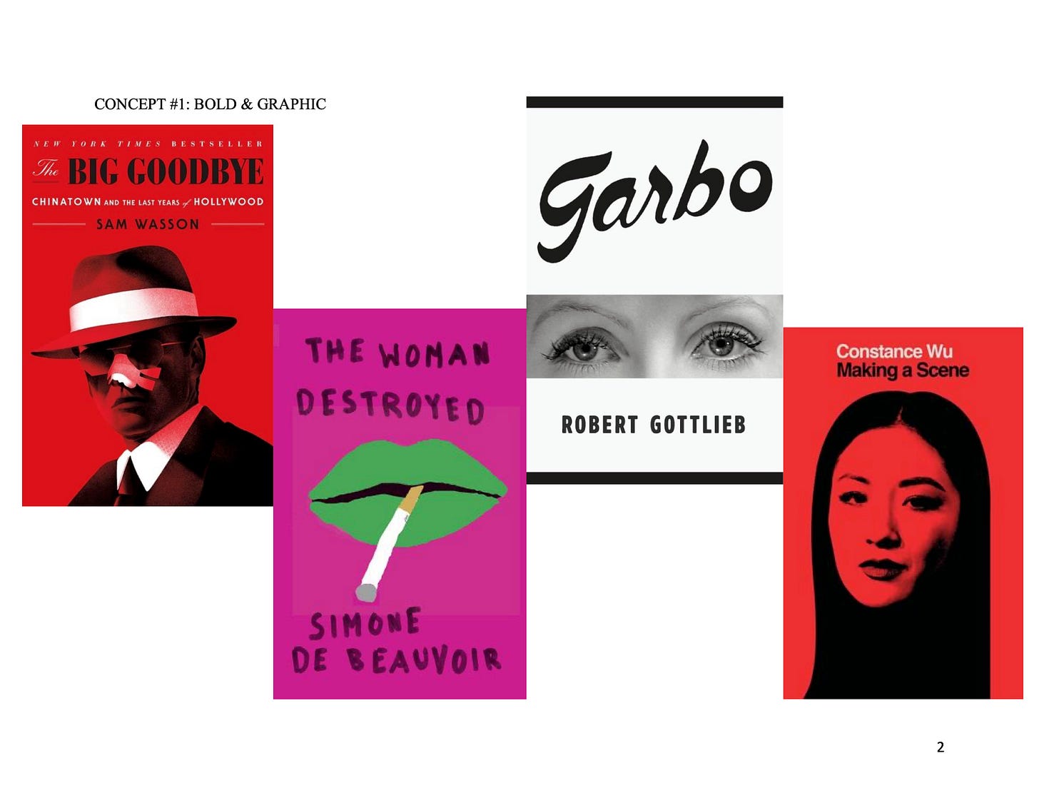
In my previous life as an editor at HarperCollins and Amazon, I put together briefs and notes on the creative direction for book covers all the time. For NOT YOUR CHINA DOLL, I knew I wanted to see something bold and iconic, something different than the usual staid black-and-white photo you typically see with biographies and narrative nonfiction. Easier said than done!
I also had a few notes on things to avoid, like stereotypical chop suey fonts or Chinese-y motifs like bamboo, lotus flowers, dragons, etc. Anna May Wong was portrayed this way in so many of her films, yet she was a full-blooded American like any of us and a modern, forward-thinking one at that. Why should she be portrayed like a delicate porcelain China doll when that’s exactly the image I’m trying to debunk with my book?
Another thing I wanted to steer clear of was the traditional Chinese color motif of red and gold. The book club I belong to, which tends to read books written by Asian American authors, has often lamented how publishers commonly peg Asian-themed books by painting them red. Not my book, I swore to myself. If you’re interested in seeing the rest of my notes and inspiration, you can peruse the full brief here.
TL;DR: The incredibly talented Vi-An Nguyen was assigned to design the cover for NOT YOUR CHINA DOLL. Had I known that ahead of time, I could have breathed a sigh of relief and dispensed with my silly little brief.
In fact, I was caught off guard when I received the first concepts for the cover during a final research trip to L.A. I couldn’t believe my eyes when the images loaded on my phone. The cover was more beautiful than I could have imagined, a dream come true. I’m not ashamed to admit I shed a few tears right then and there!
That was March. So you see, I’ve been sitting on this lovely secret for three whole months. I watched gleefully as the cover was finally unveiled this week by friend of the newsletter Rebecca Lee on her Instagram channel @annamaywongfans, as well as on my own personal Instagram. The response has been overwhelmingly positive and 100% of the credit goes to Vi-An’s memorable design. I don’t think I’m going out on a limb when I say the cover really is swoon worthy!
Earlier this week, Vi-An kindly agreed to answer a few questions over email about her design process.
I can’t thank you enough, Vi-An. I feel so indebted to you for this beautiful design!
Having worked in the book business as an editor for many years, I’ve seen my fair share of underwhelming covers and I was a little anxious about how the cover would turn out. I went as far as to put together my own creative brief, which was me being extra! But what you came up with was beyond my wildest dreams. What was your process for bringing Anna May Wong’s story to life on the cover?
I'm so glad you like it! Many (many!) people are involved in approving a book cover, but the author's opinion is always the one I value the most.
My process always starts the same way: reading! At the time I had a few early chapters of your manuscript and your brief (which was not extra—I loved it!). Then came research: collecting photos of Anna May Wong, finding fonts from her era, and gathering visual references like her movie posters. Using all these elements, I put together about a dozen cover designs to present to our publishing team, who picked their favorites to share with you.
The photograph of Anna May Wong that you chose is stunning. In fact, I saw the same image when I was going through publicity stills at Margaret Herrick Library and made a note of it. In the photo, she’s wearing one of her dresses from Dangerous to Know (1938), which was designed for her by the legendary costume designer Edith Head.
I wrote down the caption for it, too, which reads:
WHITE CREPE - makes an alluring dinner dress for Anna May Wong, Paramount star in “Dangerous to Know.” The high, Princess waistline stresses a new and sophisticated bodice treatment. Edith Head, the designer, uses a multiple strand necklace of crystals set in silver, as a jewelry accent.
How did you decide on using that picture? And then on the brilliant turn of making the dress green instead of white?
I wanted to present her as the dynamic trailblazer she was. This pose is so striking and elegant, but also powerful, like she's taking up space. There are many gorgeous photos of Anna May Wong that exist, but ultimately, the way this one projects glamour and gravitas made it The One. As a designer I also really enjoy how well it intertwines with the art deco typography, like in the way her arms hug the O in NOT. As for the colors, I thought jewel tones fit the period well while still feeling fresh and modern, and there's something fitting about changing the colors to show her in a new light—something your book does so well.
Can you say a little about your own background and whether you felt any specific connection to Anna May Wong with this project?
I'm an Asian American woman too and relate deeply to Anna May's frustration over being typecast and stereotyped. People have been surprised that I speak English, just as they were surprised at her fluency when she appeared in talkies. She defied expectations by pursuing a creative career; that part of her story really resonates with me too. And her grit and defiance in the face of discrimination is incredibly inspiring as we all continue to face anti-Asian racism to this day. I'm also a big pop culture junkie so this was really a dream project for me!


Gorgeous cover, fabulous post. I love this dive into the process of cover selection and design!
I’m broke right now. I go to food pantries. Our health care system is a health kill system.
Survived cancer twice. Murdered by bill. My book is coming out.
I will do an interlibrary loan. I must read your book.
Broke Ass Samurai. I’ve been invited to the Harvard Seth kendo tournament. Lol
My samurai club is preparing !!
Thank you for writing about my hero. Visiting LA now. I grew up here. The homeless tents make me cry. Anna May Wong would not approve.
Our country has died.